VISUALIZING CLIMATE DATA THE ‘R’ WAY | INFOGRAPHIC
Climate-change datasets deserve more than just spreadsheets. The latest release from USDSI® - Visualizing Climate Data The ‘R’ Way reveals...
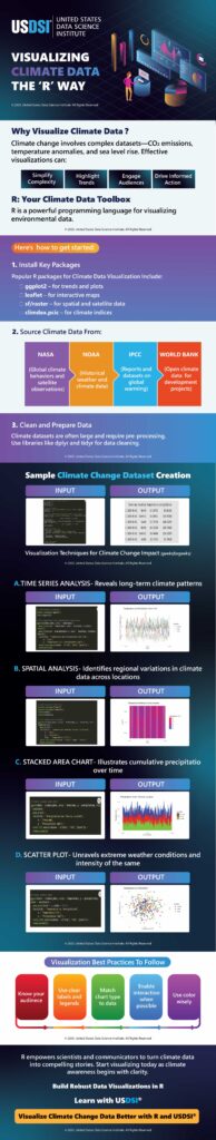
Climate-change datasets deserve more than just spreadsheets. The latest release from USDSI® – Visualizing Climate Data The ‘R’ Way reveals the power of data in telling Earth’s story. The infographic will walk you through a well-described toolkit to convert mountains of raw climate data into intuitive and actionable visuals.
From time series of shifting temperatures and rainfall to spatial maps of climate patterns, the idea is to make complex climate-change phenomena more relatable, intelligible, and urgent.
Researcher, policymaker, student, or simply a concerned global citizen, everyone can benefit from this approach to see more than just numbers and identify long-term trends, patterns of variability, anomalies, and changes that need immediate attention.
Visualizations created with R aren’t just pretty graphics. They’re tools that help data science professionals get insights, contrast, do comparaisons, and make informed decisions.
R is among the most popular programming languages, and it democratizes powerful visualization. It reduces the barrier to and makes the interpretation of climate data simple, thus empowering more professionals (even non-technical) to understand and engage with climate science meaningfully. Here are three key steps everyone must be aware of:
- Installing key packages
- Sourcing the right climate data
- Cleaning and preparing data
Learn why data visualization, especially in the case of exploding and uncertain climate data, is important and how you can take steps towards understanding climate data with R in this detailed infographic.