The Power of Illustrated Logos in the TikTok Age
The attention span of the average digital consumer is shrinking rapidly, and competition to gain their focus is fierce. You...
The attention span of the average digital consumer is shrinking rapidly, and competition to gain their focus is fierce. You have about 3 seconds before a user swipes past your content.
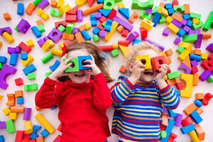
Adding to the complexity, millions of videos are uploaded daily on TikTok alone. So how does a brand make its mark? How do you say “Hey, we’re worth your time!” in under three seconds? This is the basic branding problem of the TikTok era.
Brands are missing visual relevance. If your brand doesn’t immediately capture attention, it doesn’t exist in the viewer’s mind. And for many businesses—especially smaller ones and new startups. That is terrifying!
Illustrated logos are the antidote businesses need. They express personality, values, and uniqueness at a glance, which a static text and generic visuals simply can’t achieve. A study found that logos featuring both text and image are 6% more memorable than text-only logos.
Let’s discuss how illustrated logos are a powerful tool in today’s TikTok Age.
Key Takeaway
- In today’s TikTok-driven world, you only get a few seconds to make an impression. Illustrated logos help brands grab attention fast and stick in people’s minds.
- A strong illustrated logo doesn’t just look good — it gets shared, boosts clicks, and makes your brand easier to remember.
- Colors, textures, and symbols aren’t just decoration. They tell your story, show your personality, and make your logo feel alive.
- The right mix of illustration and typography makes your logo unique and practical, so it looks great everywhere from TikTok to a business card.
TikTok’s Influence on Branding in 2025
TikTok has changed the rules of content creation and consumption. It’s not just about being online anymore; it’s about being visually stimulating. People don’t read—they scroll. They don’t wait—they react. The TikTok algorithm rewards content that is:
- Visually rich
- Emotionally compelling
- Immediately engaging
These same qualities are now being demanded of branding elements—logos included.
How Illustrated Logos Boost Brand Visibility
Your logo is often the first thing people notice about your brand—and first impressions matter. An illustrated logo can do more than just look nice. It can help your brand stand out, get remembered, and even go viral.
1. Increases Social Shares
People love visuals that are fun, clever, or cute. And when your logo fits that description, they’re more likely to share it. Illustrated logos have a way of turning into content all on their own.
They are most likely:
- Get shared as stickers.
- End up in memes.
- Can go viral as part of your visual identity.
In short, an illustrated logo doesn’t just represent you—it becomes a part of the conversation.
2. Improves Click-Through Rates
Your profile picture is a major factor in whether someone clicks on your TikTok page, YouTube, or website. And when your logo is illustrated, it naturally stands out in a sea of bland icons and initials.
An illustrated logo:
- Builds curiosity.
- Creates a memorable impression.
- Makes your page feel polished and professional.
That extra click could be the start of someone diving into your content, subscribing, or making a purchase. It all starts with that little image.
3. Better Brand Recall = Better SEO
The more memorable your brand is, the more people will engage with it. And when people remember your illustrated logo, they’re more likely to:
- Search for your name.
- Tag you in comments.
- Visit your site or social pages more than once.
This sends positive signals to algorithms across platforms that this brand is relevant. And when platforms see that kind of engagement, your content is more likely to get recommended, ranked, and promoted.
So yes, your logo can even help with SEO, just by being unforgettable.
Expert Tips for Creating Effective Illustrated Logos
1. Mastering Color and Texture
“Color is a powerful tool in logo design, and can be used to evoke emotions and convey meaning.”
Use a Limited Color Palette
Using a focused color scheme of 2–4 colors ensures brand cohesion and visual harmony. It also makes your logo more adaptable across platforms and print media.
Choose Colors with Purpose
Color psychology plays a crucial role in how audiences perceive your brand. Here’s a quick reference:
- Blue: Trust, professionalism (great for finance, tech)
- Red: Passion, urgency (ideal for food, fitness)
- Green: Growth, health (perfect for eco or wellness brands)
- Yellow: Optimism, creativity (great for lifestyle or children’s brands)
Affordable brand identity services aim to maximize emotional impact without overwhelming complexity.
Add Texture for Depth and Style
Textures add a layer of tactility and charm to illustrated logos:
- Grainy textures give a retro or vintage feel
- Watercolor washes create a soft, artistic tone
- Rough ink lines offer a handcrafted, authentic touch
Many top-rated providers offering the best monogram logo design services also use subtle textures to help monograms feel premium and custom-made.
2. Creating a Visual Narrative
“An illustrated logo should tell your brand’s story at a glance.”
Use Symbolism and Metaphors
Good illustrated logos often go beyond literal images. They use visual metaphors to make deeper connections:
- A mountain could represent ambition or strength.
- A lighthouse might suggest guidance or hope.
- A tree might symbolize growth, stability, or eco-consciousness.
Try creating dual-meaning visuals (like a fox that also forms the shape of a flame) for added intrigue and memorability.
Align Your Story with Brand Identity
Make sure the story aligns with your brand mission and values. Whether your brand is playful, bold, elegant, or mysterious, the logo should reflect that consistently.
Ask yourself:
- What story does your brand want to tell?
- What are the emotions or values you want to evoke?
- How does your product/service fit into your customer’s life?
Your illustrated logo should reflect what you do, not just who you are.
Use Composition to Guide the Viewer’s Eye
Strategic use of space, balance, and orientation can subtly reinforce your message:
- Circular Logos: Unity, wholeness
- Diagonal Elements: Movement, energy
- Symmetrical Layouts: Stability, professionalism
The best logo design services in the USA know how to bring visual elements together in harmony.
3. Choosing the Right Typography
“Typography is the voice of your brand. In an illustrated logo, it’s what grounds the art in meaning.”
Typography is often underestimated, but it can make or break your illustrated logo. Whether the logo is mostly visual or relies on a wordmark, type choices must align with your brand voice and identity.
Pair Typography with Illustration
Type should complement the illustration, not clash with it.
- Playful art? Use rounded fonts.
- Elegant design? Try sleek serifs or clean sans-serifs.
Avoid overly complex fonts if your illustrated elements are already detailed — simplicity in type balances complexity in imagery.
Customize Lettering
Unique letterforms make logos memorable.
- Consider hand-lettered or modified fonts for added originality.
- Monograms, in particular, benefit from stylized ligatures or unique initial treatments.
This is a key offering in affordable logo creation services that want to help small businesses look premium without overextending their budget.
Consider Readability at All Sizes
Your logo must be legible everywhere — from business cards to mobile icons.
- Always test your logo at various sizes.
- Avoid super lightweight fonts unless paired with bold graphic elements.
Final Thoughts
Your logo is more than a business card in today’s TikTok-first world. It’s:
- Your voice
- Your vibe
- Your visual storyteller
An illustrated logo doesn’t just show who you are — it makes people feel who you are. And in an age driven by feelings, stories, and scroll-stopping moments, that’s powerful.
So, whether you’re just starting out or leveling up your brand, don’t overlook the power of illustration. It might be the missing piece between being scrolled past and going viral.
FAQs
What’s the difference between an illustrated logo and a regular logo?
An illustrated one includes visual elements like drawings, icons, or custom artwork that go beyond plain text. It adds personality and storytelling, while regular logos often stick to simple fonts or symbols.
Are illustrated logos harder to use across different platforms?
Not if they’re designed well. A professional designer will create scalable versions that look great everywhere, from TikTok profile icons to billboards and packaging.
Do illustrated logos work for all types of businesses?
Yes, but the style should fit the industry and audience. A playful illustrated logo might work for a kids’ brand, while a sleek, minimal illustration could suit a tech or finance company.