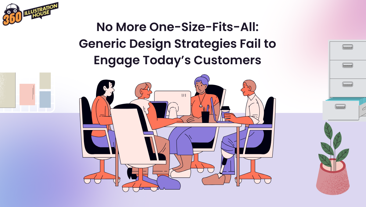
No More One-Size-Fits-All: Generic Design Strategies Fail to Engage Today’s Customers
Hot take: People treat brands the same way they treat people on dating platforms. Yes, think about it. They size...

Hot take: People treat brands the same way they treat people on dating platforms.
Yes, think about it.
They size you up in three seconds, decide if they “vibe” with you, and move on if something feels off. It’s the same energy we use when judging a dating profile. One look at the colors, the tone, the expressions, and we instantly know if we’ll swipe left or right.
And because people think this fast, their minds don’t stop to analyze the way a professional would. They just react. They lean in if something feels familiar or meaningful. They pull away if it feels cold or generic.
So, what does this mean for brands? Simple – generic design strategies are not going to work anymore.
And because people think this fast, their minds don’t stop to analyze the way a professional would. They just react. They lean in if something feels familiar or meaningful. They pull away if it feels cold or generic. It is extremely important for brands to understand that customers are no longer evaluating them through their logo or home page design.
Customers have become critics (a tough one like Gordan Ramsey.) One failed design or a visual that does not match your brand’s identity, they might label you “an idiot sandwich.”
Brands that rely on generic templates miss that moment of connection. They feel distant, replaceable, and somehow “not for me.” And in a world where customers have endless choices, feeling forgettable is the most expensive problem a brand can have.
So why do people connect instantly with some designs and scroll right past others? Let’s look at the real reasons.
What Do Generic Design Strategies Actually Mean
A generic design isn’t just plain. It’s predictable. It has safe layouts, common fonts, and familiar templates. This is why we call it safe design, because people think that there is nothing that can go wrong with this.
But the truth is, safe design often looks just like everyone else’s.
The “Template Mindset” Problem
Templates save time, but they also erase identity. When every brand uses the same layout, it’s like walking into a mall where every store has the same signboard, clothes, and interior.
Users stop noticing.
This approach quietly harms brands in ways most teams don’t realize:
- Brand blur: When everything looks familiar, nothing stands out.
- Lost story: Templates rarely convey a brand’s tone or message.
- Missed emotion: Repeated design patterns make experiences forgettable.
“Consistency” is Misused
Many brands use the word “consistency,” but they don’t always use it correctly. Consistency was originally meant to build trust. It helps customers recognize you and understand what you stand for. But somewhere along the way, it got twisted into something rigid. Instead of guiding design, it started controlling it.
That’s why so many brands end up with visuals that look identical across every platform. Same layout, same icons, same shapes, same voice. It’s safe, but it’s also flat. And customers don’t connect with flat.
Real consistency in design doesn’t mean copying and pasting the same look everywhere. It means carrying the same meaning across different expressions. For example:
- Keep your core identity steady, like your colors, tone, values, and personality.
- Let the design adapt to different audiences, moods, or moments.
- Use context to guide your choices. People behave differently on TikTok, on your website, and in your packaging, so your visuals should respond to that.
The Problems: Why Generic Design Strategies Fail (Might I Add: “Miserably”)
Customers See More Designs in a Day Than Ever Before
Scrolling is a habit now. People move through Instagram, TikTok, YouTube, emails, websites, and ads in seconds. They see hundreds of visuals before lunch, which means your design competes with everything from Apple ads to a random café’s Instagram post.
So ask yourself: Why would they care about a design that looks like any other template?
When everything looks the same, nothing stands out. It turns invisible.
People Don’t Fit into Personas Anymore
Personas used to define “the user.” A single sketch representing an audience segment. But modern consumers can’t be boxed like that. The same person might compare investment plans in the morning and browse meme accounts at night.
This reality means:
- A static persona can’t capture dynamic human behavior.
- Design strategies must adapt to changing goals, moods, and contexts.
- Tools like journey mapping or adaptive UI testing help track real-time intent, not assumptions.
The best custom digital illustration USA agencies understand this shift, designing visuals that evolve with people’s changing identities.
Cultural Blind Spots
Many “generic/safe” designs overlook cultural nuance. Something as small as a color or phrase can shift meaning across regions. For example, white is associated with purity in Western cultures but mourning in parts of Asia.
Avoiding blind spots means:
- Doing localized user research instead of relying on global trends.
- Choosing imagery and tone that reflect cultural comfort zones.
- Testing regional campaigns separately, not as translations of one global asset.
Design strategies that respect culture earn credibility faster than those that impose uniformity.
Emotional Disconnect
Customers now choose brands the same way they choose people to follow online. They want personality. They want honesty. They want visuals that speak directly to them.
So, when working on design, it is important to keep in mind that design isn’t only visual, it’s emotional. People react subconsciously to shapes, words, and colors before they process meaning. Generic design strips that emotional layer away, leaving a sterile feel.
To fix that, brands can:
- Tell micro-stories through visuals that echo their values.
- Use texture, animation, or tone that adds warmth.
- Create “human touchpoints” like real photography or candid copy.
Custom artwork from affordable custom illustration services can add personality and warmth that stock visuals can’t replicate.
Digital Fatigue
People aren’t overwhelmed by content anymore. They’re overwhelmed by how similar everything looks. Every platform is packed with the same polished banners, the same stock photos, the same oversized headlines, and the same layout patterns. After seeing these visuals hundreds of times, users develop what’s basically “design blindness.” Their brain spots a familiar pattern and automatically checks out.
They scroll faster
They skip faster
They stop paying attention unless something feels refreshing or real
This is why brands need more than clean layouts. They need variety and context that actually breaks the pattern in the user’s mind.
Authenticity is Much-Needed
A funny shift has happened. People used to be attracted to polished, “corporate perfect” designs.
But oh well, not anymore.
Now they’re drawn to:
- handmade textures
- real photos
- rough sketches
- simple fonts
- natural colors
- designs that look human
Why?
Because perfect feels fake.
And fake loses trust.
Today’s audience can spot low-quality, low-effort, stock, and template design from a mile away.
People Want to Know Who They’re Buying From
This is the biggest behavior shift of all. Customers don’t look at design just for beauty. They look at it for identity. They want to feel like the brand understands them and stands for something real.
They ask questions without even realizing it:
What does this brand believe in?
What’s their personality?
Would we get along if this brand were a person?
Do they care about the same things I care about?
Good design answers those questions before the customer reads a single line. It shows values, personality, and intention. It tells people “this is who we are” and gives them a reason to trust you.
We see this same shift with influencers. Years ago, people followed anyone who looked aspirational.
Pretty feed?
Nice outfits?
A discount code?
That was enough. But now followers choose influencers the same way they choose friends. They only follow people who share their beliefs, their humor, their routines, and even their worldview. If a creator feels fake, filtered, or disconnected, people unfollow instantly.
Design works the same way. If your visuals feel generic or neutral, customers don’t see a real identity behind them. They can’t tell what you stand for or why you’re different.
Conclusion
Do you know that people spend a global average of 6 hours and 40 minutes per day on screens? That means they are constantly scrolling, clicking, watching, comparing, and absorbing visuals without even thinking about it. In that time, they visit dozens of websites, skim hundreds of posts, and swipe through more content than any generation before them.
Their eye moves fast.
Their mind moves faster.
And their attention is brutally honest.
Because they consume so many visuals every single day, they’ve developed a sharp instinct. They instantly know what feels generic. They instantly know what feels genuine. They can tell when a design strategy is made for “everyone” versus when it is made with intention, personality, and a point of view.
Generic design tells them nothing.
Custom design tells them who YOU are.
So here is the real question every brand should ask:
Why should someone choose you when your design looks like everyone else’s?
Your answer decides how people remember you. And it becomes the foundation of a visual identity that customers actually connect with, trust, and return to.
FAQs
Why do brands still use generic design if it doesn’t work?
Because it’s fast, cheap, and easy to scale. But what saves time in production often costs engagement later. Brands that take shortcuts lose uniqueness, and users notice quickly.
How can a brand stay consistent without looking repetitive?
Keep core elements (logo, tone, colors) steady but vary composition, imagery, and messaging by audience or context. Think of it as a melody with the same tune, different rhythm, and a flexible design strategy that feels fresh each time.
Can AI design truly feel human?
AI can design quickly, but it can’t naturally create the emotion, personality, or lived-in meaning that makes visuals feel human. It still needs human direction to shape tone, mood, and intention. That’s why brands that want real connection still rely on designers, especially when building an affordable custom illustration website that needs authenticity, not automation.


